Interactive Example
Tags can be static, used to provide additional information on an item, or interactive, with the abilities such as editing or clearing them from data sets or linking to other similarly tagged elements.
Appearance & Behavior
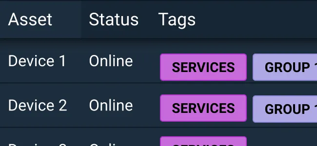
Tags are useful for identifying important information at a glance as well as filtering and categorizing items by keywords. Other visual indicators, such as color, help to draw users’ attention and assist in categorization of like items.
Tags in Astro
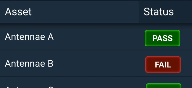
In code, Astro provides Status Tags. A Status Tag is system generated and typically has three states (Pass, Fail, and Unknown), though Astro provides tags outside of this scope as well. A Status Tag cannot be removed or cleared from the interface. There are two kinds of status tags: Pass/Fail/Unknown tags that are fixed in both text and color, and customizable tags correlating with status symbol colors that are text responsive. Status Tags should not be interactive. To use other colors or make a tag interactive, custom coding can be added on top of the provided Status Tag code.
Use Cases
Status Tags are commonly used to show the status of a system such as an antennae or another communication device. Status Tags add important information to the status of a system and can use domain and system-specific terminology such as Offline, Online, Connecting, or Under Maintenance.
Tags are most commonly used in large data sets, such as tables, to help filter and organize information. Tags are especially useful for scanning and comparing data sets for meaningful information and relationships. Users are allowed to create, edit, and delete tags which help manage their large, dynamic data sets.
Common Mistakes
- Users may confuse tags with buttons, so it is important to distinguish the shape and interaction of tags from button components.
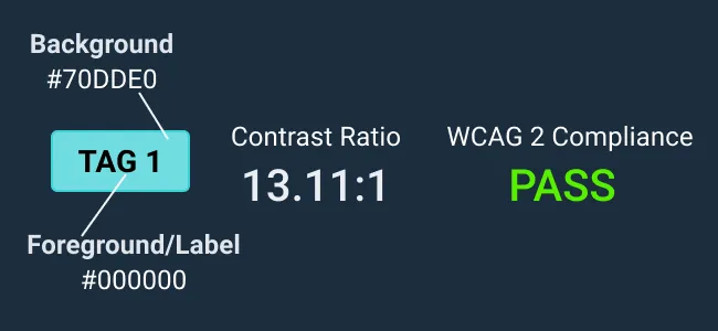
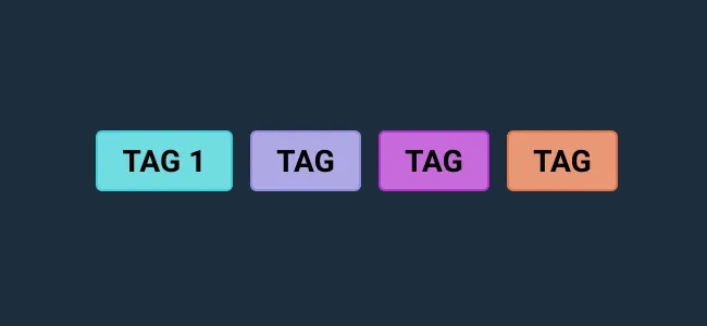
- When using tags, colors should not overlap status or classification colors. We recommend using standard tag colors. For further color guidance, please refer to the usage documentation Color .
- Keep in mind that using tags adds to the visual noise of an interface, so use tags in moderation.
Examples


Asset Status
| Asset | Version | Status |
|---|---|---|
| Documentation | N/A | Available |
| UI Kit - Dark | v7 | Available |
| UI Kit - Light | v7 | Available |
| UI Kit - Wireframe | v7 | Available |
| Web Component | v7 | Available |
| Component Tokens | N/A | Planned |